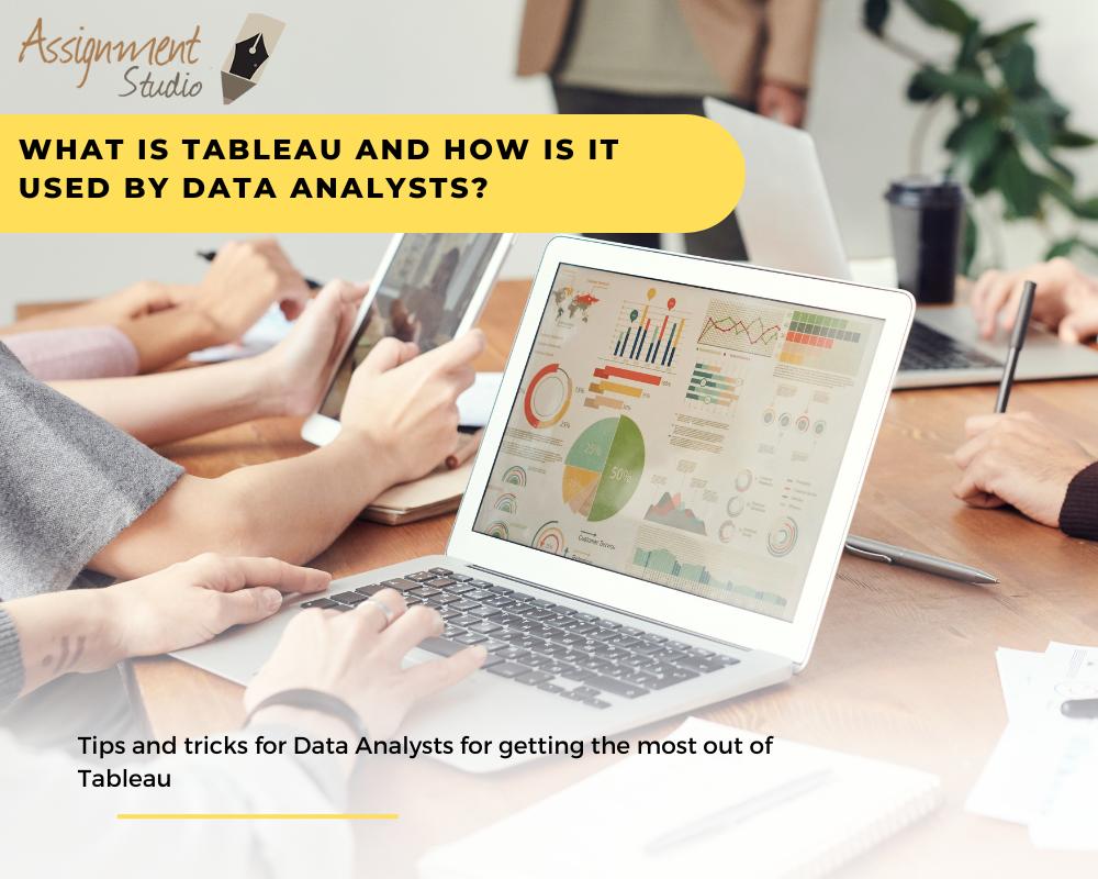
At the start of 2020, the digital world was found to have approximately 44 zettabytes of data. We are living in a world in which collecting useful data is easier and we have the ability to gather a large amount of words and numbers but in order to make it useful for humans, there is an important task we need to perform- data visualisation. Humans respond well to pictorial information rather than text so making the data presentable (in the form of graphs, scatterplots, maps, etc.) is an important part of the decision making process after the data is analysed. Tableau makes this tedious work much simpler for non-technical users (who do not have programming skills) with its many data visualisation features that are designed to deal with big data, making the work of data analysts much easier.
Table of Contents
What is Tableau?
Tableau is a powerful data visualisation tool created in 2003 and is now gaining popularity with the data analyst community due to its easy-to-use functions. As it is designed keeping in mind the end user- business decision makers- it has the ability to quickly create visually appealing dashboards that are essential in the business intelligence community.
Throughout the data analysis process, Tableau aids the analysts from data preparation to sharing it with governance and data management with its many components. The tools are divided into two categories- Developer tools (creating visualisations like charts, dashboards, reports, etc.) and Sharing tools (the software to share these visual reports- by uploading them to the cloud and reading them online on a single platform- like Google Analytics).
Data visualisation and its importance
In the data analysis process, data visualisation is the last step after the definition of the question, collecting, cleaning and analysing the data. During this process, data analysts translate the insight found during the analysis stage and present them to the relevant individuals (for example, business analysts).
In the business intelligence industry, the following types of data insights are required to observe the trends and make calculated business decisions in the future with the lowest risk and the highest growth strategies:
- Changes over time
- Relationship between two variables (for example, advertisement cost and revenue)
- Frequency of certain events
- Discovering clusters and connections within a network (like a customer network)
- Value versus risk analysis
All these different kinds of insights are presented in a compelling manner in Tableau by the analysts as linear graphs, bar charts, pie charts, maps, density maps, scatter plots, histograms, tree maps, spatial charts, flow maps (like Sankey diagrams), etc.
Types of Tableau products and their uses for data analysts
The Tableau Product suite contains the following softwares for its two main functions- development and sharing:
- Developer tools: Tableau Desktop, Tableau Public
- Sharing tools: Tableau Online, Tableau Server, and Tableau Reader
As Tableau has a highly intuitive user interface with drag and drop features, very similar to Excel, users without a programming background quickly learn to explore functions (with the right click button). Here’s how Tableau features are aiding data analysts throughout their process:
- Tableau Prep provides great use to data analysts due to its easy data cleaning process. Combining data from several sources becomes much easier with its intelligent import and combine feature that lets users combine fields with similar labels in different files (this is called data blending). It can extract data from any complex database (Amazon web services, Microsoft Azure SQL database, Google Cloud SQL, etc.)
- Show-me feature allows users to see the sample view of the data visualisation without having to reorganise the data. This way they can choose the best data presentation.
- What-if analysis gives freedom to analysts to put in different data and calculations in the rows and columns to see changes in patterns so that they can predict situations.
- Statistical analysis tools are very easy to use and include every operation from basic to complex formulas.
- User interactive dashboards allow users to peruse through the data visualisations (uploaded on the cloud) and experiment with them (with limited parameters) created by analysts. This helps decision makers update their business models.
- Constant updates of the software based on feedback from users allows the software to constantly get useful updates.
How Tableau stands out
- In-built data security level options without the need to script
- Perfect for processing big data without coding knowledge
- Integrates with over 250 applications
Takeaways
There are many data visualisation tools available but Tableau can immensely help data analysts as it makes the process quicker without the need to code. Data analysts also find this software very useful because the end-users do not find it intimidating and complex and instead it offers ease of sharing liberty to experiment with the data (using canned filters).


