At first glance, it may seem like a simple spreadsheet software program, but Microsoft Excel is a devil in disguise when it comes to data analysis. The software can be utilised in both qualitative and quantitative research projects. It has the capacity to hold a large amount of data meaning it can be a useful tool for sorting and managing both quantitative and qualitative data.
We will discuss the various ways Microsoft Excel can prove to be an exceptional tool for data analysis and help young researchers tackle complex tasks.
Table of Contents
A brief history of Microsoft Excel
Let’s start with the basics, you will rarely find someone who doesn’t know what Microsoft Excel is but by chance if you are new to the software let us do the honour of introducing it to you. Microsoft Excel has been around since 1984 when it was first made available for the Apple Mac. It was later redesigned as Microsoft Excel 2.0 for a new platform in 1987 when the company released its own computer and operating systems. Features like 3D Charts, Outlining, Toolbars and Drawing Capabilities were later added in 1990, to the run-time version of Windows.
In the 2010s and later, the new versions that were released now come with chart updates, recommendations for users on which Pivot Tables to employ, and other features all designed to make Excel for data analysis better.
How can one use Excel in Research Work?
As we mentioned above, excel has capabilities that make it a perfect tool for data analysis. The software can be used in both qualitative and quantitative research projects. Students working on their research papers are always in a hurry and need something that can make their work easy and save time. Excel is an efficient software and it is designed to help users save time and make sure it is accurate. With using proper features and formulas you can transform your unorganised data into an automatic analysis.
Microsoft Excel is much more than just creating tables and inputting data. It is only the start, there are many features that can sort and manage data, complete mathematical calculations, turn complex data into easy-to-understand graphics and charts, build forecasts and help provide answers to complex questions.
Why use Excel for Data Analysis?
Data analysis is the process a person can use to clean, introspect, change and model data. The goals of discovering and understanding important information, coming to solid conclusions, formatting and editing it properly and preparing a particular decision-making process can all be accomplished with the help of data analysis.
There are various ways of conducting data analysis properly and with Excel assistance, students and researchers can all accomplish this with ease. Let’s discuss some features of Excel that help with data analysis.
Sorting of data
Excel can sort data easily and quickly, data can be sorted in descending or ascending order as per user requirement. It can arrange data/lists in alphabetical order or in numerical data rank from highest to lowest or vice versa.
Filtering
Filtering is another data analysis type that can be done with Excel. Excel can filter data into various subsets, viewing data points that fit their chosen criteria. Excel has this exceptional feature that narrows down data, has it met specific criteria or views limited cells that too while the original data remains intact.
Conditional Formatting
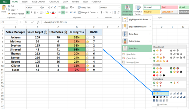
Another feature of Excel is that it is easy to use. This feature allows a user to highlight cells in a different colour based on the user’s criteria and the value of the cells. It is an excellent method for highlighting data visually or identifying trends and outliers in data.
Charts and Tables
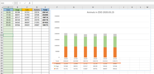
Excel can also provide charts to simplify data analysis conclusions. Designing charts in Excel is user-friendly and uses colours, and a simple presentation to make them easy to understand. Charts in excel are simple and can make insights drawn from your data analysis understandable. The table command is excellent for converting data into a formatted table, which users can then sort and filter for easy organisation and viewing.
Pivot Tables
The pivot table is an interactive feature in Excel which is used to manipulate and analyse large structured sets of data. It helps make the information more concise and take important content from large and detailed data. It summarises, sorts, counts, totals or averages the data in a spreadsheet.
What-If Analysis
What-if analysis is an Excel tool that helps run reverse calculations, sensitivity analysis and scenario comparisons to observe the impact an independent variable has on a dependent variable.
Analysis Toolpak
You can use this Excel add-in tool to assist with complicated statistical, financial, and engineering analysis. It offers statistical tests for linear systems like ANOVA, t-Test, and z-Test as well as tools for regression, sampling, and Fourier analysis.
Descriptive Statistics
Descriptive statistics is an add-in of ToolPak which allows the user to avoid running individual statistical analysis manually for statistics that are commonly used, such as mean, mode and standard deviations. So with just a click, you will get the statistical value of the data immediately.
And these are some ways one can use Microsoft Excel for data analysis.


